Shrimpie
Lab24-09-2026
My girlfriend and I didn't want to spend our first few weeks with our son going back and forth with friends and family about dates and times. So I wireframed a kraamvisite planner in Claude Design and built it in Claude Code, as a UX designer who had never shipped an app before.
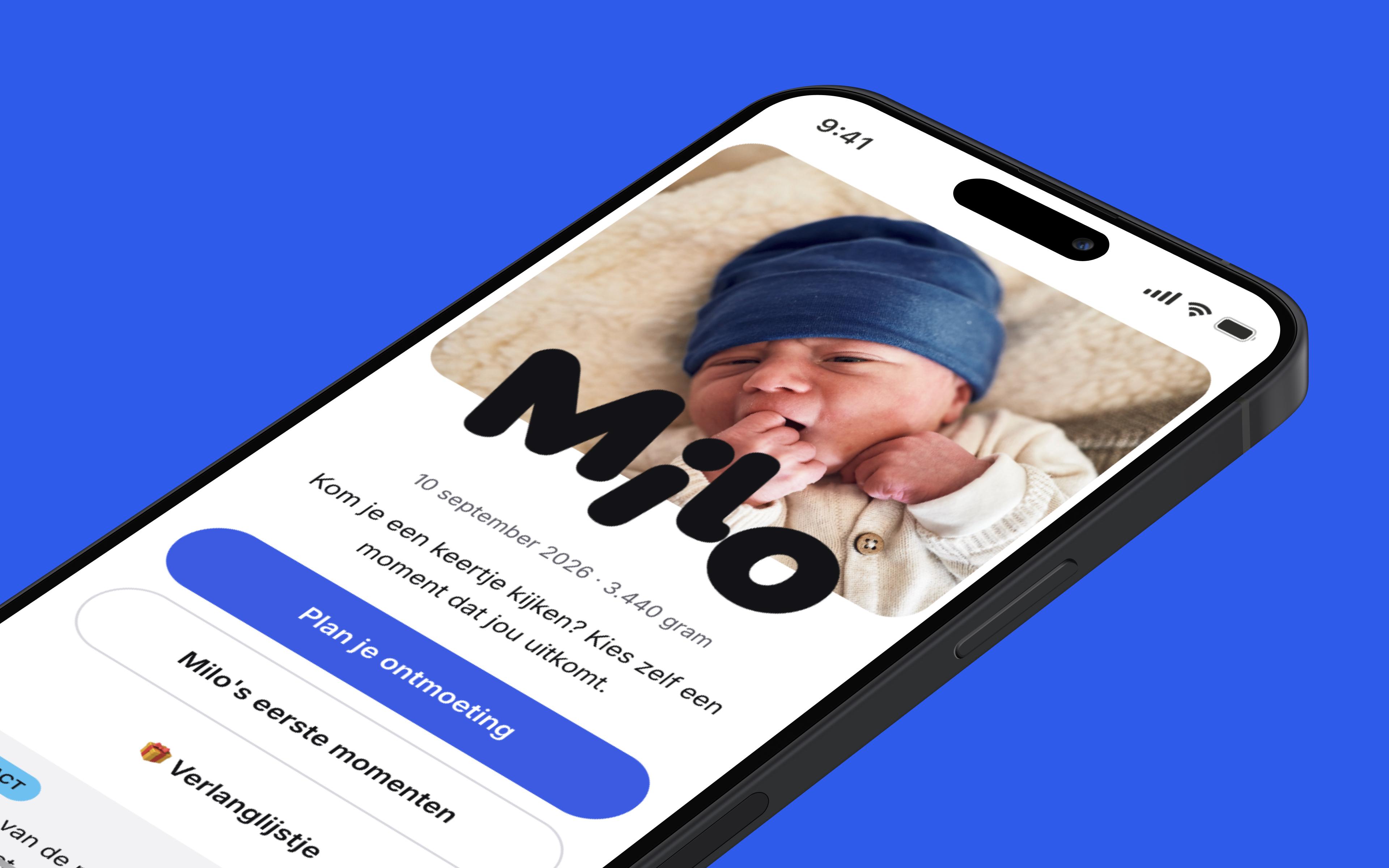
Kraamvisite is the Dutch version of the maternity visit: in the first weeks after a birth, family and friends come round to meet the baby and its parents. My girlfriend recently gave birth to our first, Milo, and the subject had been circling all through the pregnancy. She kept coming back to the same three questions:
- How do we stay in our own bubble as much as possible?
- I want friends and family to meet Milo, but how do we spread that out?
- Who, and when?
Those worries were the brief. I spent my spare time building the answer, under the name ‘Shrimpie’.
A web app, in the end: scan the code on the birth card, pick a moment out of the days we've opened up, get a confirmation by email. No account, nothing to install.
From worries to wireframes
My girlfriend's worries gave me a reason to spend my spare time on an answer. I started in Claude Design, to get a first shape for the web app. My prompt looked like this, translated from Dutch:
Goal
Wireframes for a small, cheerful web app: scan a QR code on the birth card, book a 30-minute slot to come and meet the baby. Simple, warm and personal — nothing that looks like a business booking tool.

Style and tone
- Mobile-first, people scan with their phone.
- Personal: the baby's name and photo (Shrimpie, his working name).
- Few steps, few fields.
- Dutch, informal (je/jij).

Three flows
1. Visitor books a slot, through the QR code.
2. Visitor changes a booking, through a unique link in the email.
3. Parents set the period and the times, see the bookings and upload photos, through their own link.

Screens
- Visitor: intro (photo, name, "Plan your visit", "See the photos") → pick a date and a slot → name and email → confirmation with add-to-calendar.
- Gallery: a grid, tap for a bigger image.
- Confirmation email: date and slot, a thank you from the baby, a link to change the booking, a link to the gallery, add to calendar.
- Parents: the period and the time blocks, the bookings, the photos.

Constraints
- 30-minute slots, one booking per slot; taken is not selectable.
- Changing only through the link in the email, not on the success page.
- Only the days and times the parents opened up are bookable.

What I need
Low-fi wireframes for all of it, mobile-first, with the flow between them. No visuals yet — structure, steps and states.
The design agent got to work and came back with a first proposal. That first go was already decent and thorough; it even offered variants for specific features, like showing the photos in a story-style overlay. After a few tweaks to the flows and the copy, I had Claude build a few prototypes, and the product came more to life. That gave me more feel for it, and more to say in the next round of feedback. The goal was to keep it simple, though — I was in the middle of a renovation — so not too much fiddling with the design/UI.
Once I was reasonably happy with the screens, I moved the lot over to Claude Code, to take the project from concept to something real. I put the design handoff, wireframes and prototypes, in a project folder Claude Code can reach, and started with this prompt:
Context
We're having a baby. My design for a kraamvisite planner is in `design-handoff/` in the root; read its README and every screen first.

The problem
Everyone wants to visit in the first weeks. It runs on WhatsApp now, and my girlfriend doesn't want to be the one tracking it. Visits yes, not all at once.

What I want to build
A mobile-first web app. Visitors scan the QR code, pick a free moment and get a mail confirmation. No account, no app; they move or cancel it themselves. We set the days, times, visit length and day maximum, and see who's coming.

Requirements
- Safe and privacy-minded: our address, the visitors' details, a forwarded QR.
- Free: no monthly cost for hosting, database or mail.
- Maintainable: I should still understand it in a year, for a next baby.
- Dutch, informal (je/jij).

How I want to work
- No code yet. A plan first.
- Be critical of my design. Say what's missing, what's too complex and what should change.
- Ask your questions before you assume. A few questions too many beats a plan built on guesswork.
- Explain technical choices in plain language, with the trade-off: what it costs, what the risk is, how hard it is to change later.
- Build in small steps I can test on my phone after each one. For bigger features, a clickable prototype first.

What I want back
1. Your questions for me.
2. Then a plan: the stack (framework, database, hosting, mail) and why, a simple data model, the build order in phases, the risks around privacy and abuse, and what we deliberately don't build.
The plan
Claude didn't start coding yet. It started with questions to better understand the scope. What happens when two people pick the same slot at the same moment? What if someone forwards the QR code? Can a visitor see where we live before they've booked? The plan that came out of it answered things I hadn't thought to ask, and cut the build into four steps:
- The visitor side, on fake data. No database, no login, no email. Only what grandma sees: intro, pick a day, pick a time, confirm. So I could click the flow on my phone before any of it actually worked.
- The database underneath. Only once the flow felt right did Supabase go in behind it. The screens stayed exactly the same; only where the data came from changed.
- Our side. Logging in with a link in your email, no password. A list of who's coming. And the settings: which days, which times, how long a visit lasts and how busy a day may get.
- Later. More than one baby, archiving, wiping data. Parked on purpose.
A few of the choices in that plan I found interesting as a designer:
- The address only after booking. The QR link is for anyone who ends up holding the card. Where we live is for the people actually coming.
- No account for visitors. Moving or cancelling runs through a personal link in the confirmation email.
- All the copy in one file. So I could keep tuning the tone without digging through code.
- Zero euros a month. It all runs on free plans. The daily reminder email doubles as the alarm clock for the free database, which otherwise falls asleep after a week of silence.
The plan turned into a living document. Every new feature got a chapter of its own in it: why, how, and how we'd check that it worked. Everything that went wrong went into a separate file of lessons, which Claude reads at the start of every session. So nobody had to find the same mistake twice. Me included.
What we settled on in the end, all of it free:
What it became
After a lot of prompting back and forth, this is what was left, and what went out to friends and family. A unique link to plan your visit, with "Milo's first moments" beside it — a photo story of the kind you know from Instagram. Booking a moment gets you a confirmation by email, and a reminder the day before; that same mail carries a personal link to move the visit or cancel it, without an account anywhere. Behind all of it, a back end where we manage the settings and visits.
What I'm taking from it
I'm a UX designer, not a developer. Shrimpie is live on an address of its own anyway, which I wouldn't have expected at the start of the pregnancy. A few things I'm taking from it:
- Building got cheap, deciding didn't. Claude builds anything you ask for, and fast. Working out what doesn't go in stayed my job.
- Prototype first, even when building only takes an hour. A clickable prototype is still quicker, and easier to throw away than a feature you've already grown attached to.
- Certainty isn't proof. Claude always sounds convinced, including when it's wrong. A few times a diagnosis was simply wrong. A setting it said was missing was already there. A warning got called an error. So my standard question became: show me. On a real phone, in Safari, measured instead of guessed.
Shrimpie started with a simple question from my girlfriend: how do we stay in our own bubble as much as possible? The answer turned into an app, but the goal stayed small. She doesn't have to arrange who's coming. She just gets to enjoy whoever's there.